


As full-stack developers, we often love to develop applications out of the box with tools that can visually design your application's UI and define your data and API layers that can seamlessly integrate with the application's UI.
AWS Amplify Studio amplifies your development with front-end and back-end by provisioning the right AWS resources under the hood for the right purposes and also the ability to easily integrate into the design.
Working with data
Amplify Studio makes it really easy to define and manage your data irrespective of the environment it's used in.
Defining your data

Amplify Studio's Data allows you to define Amazon DynamoDB keeping in mind the properties with the right type and also powered with AWS AppSync where which generates a GraphQL schema under the hood.
enum TopicLevelEnum {
  INTRODUCTORY
  INTERMEDIATE
  ADVANCE
}

type InfoCard @model @auth(rules: [{allow: public}]) {
  id: ID!
  title: String!
  short_description: String!
  long_description: String!
  thumbnail_url: AWSURL!
  categories: [String!]
  services: [String!]
  topic_level: TopicLevelEnum
  aws_docs_url: String!
  aws_workshow_url: String
  community_url: String
  aws_samples_url: String
  dislikes: Int
  url: String
  s3_thumbnail: String
  likes: Int
}

type Service @model @auth(rules: [{allow: public}]) {
  id: ID!
  service_name: String!
  category_name: String!
  logo_url: AWSURL!
  url: String
  s3_logo: String
}
Now that data is defined and the AWS resources - AppSync API and DynamoDB tables for the same are created with @model directives by AppSync. Since the API is using public read, @auth(rules: [{allow: public}]) is part InfoCard and Service this will ensure that the auto-generated CRUD APIs for them will allow public access.
Generating data
The content management feature of Amplify Studio is elegant for ensuring an admin/content creator role to create or update content that the front-end application would be consuming. This uses the data definition based on your GraphQL schema and DynamoDB schema with a form-based input.
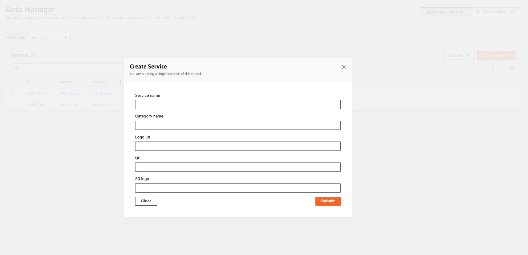
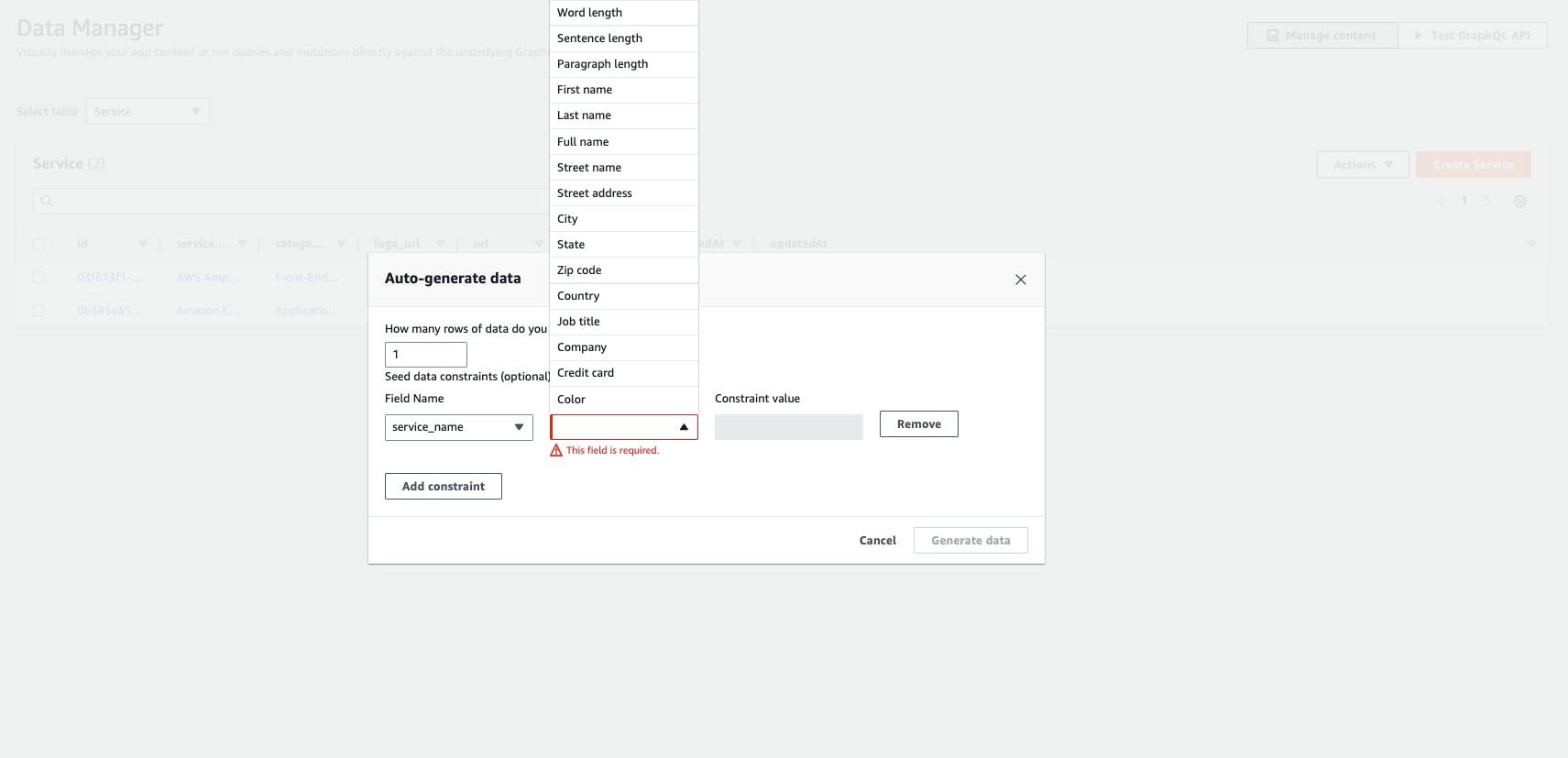
Amplify Studio also has an underrated feature that developers would love when using this during the course of development, Amplify Studio has auto-generate data which is handy for the development phase where developers need not worry about "there isn't enough data to display on the front-end" instead generate up to 100 records with the feasibility of setting some constraints so that you get valid data.
Test your data
With the data populated, you would need to ensure the GraphQL APIs with AppSync are working as expected. Amplify Studio also features a GraphQL editor to simulate and test the APIs.
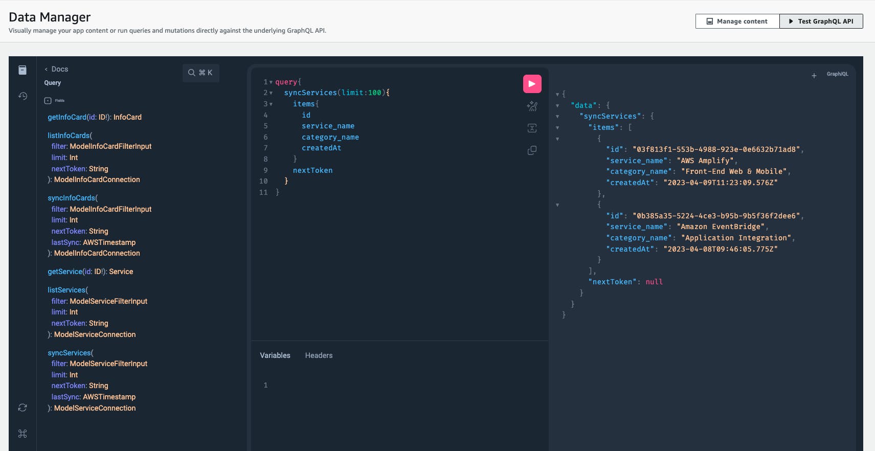
The simulator provides the API docs - where you can navigate the different queries, mutations or subscription.
Amplify Storage
Amplify Storage let's you manage the media files and assets which are stored on Amazon S3. Amplify Storage will first create the Amazon S3 bucket where you can set the authorization rules for user to upload, view or delete the objects (files in this case) on S3 bucket.
Managing files on Storage
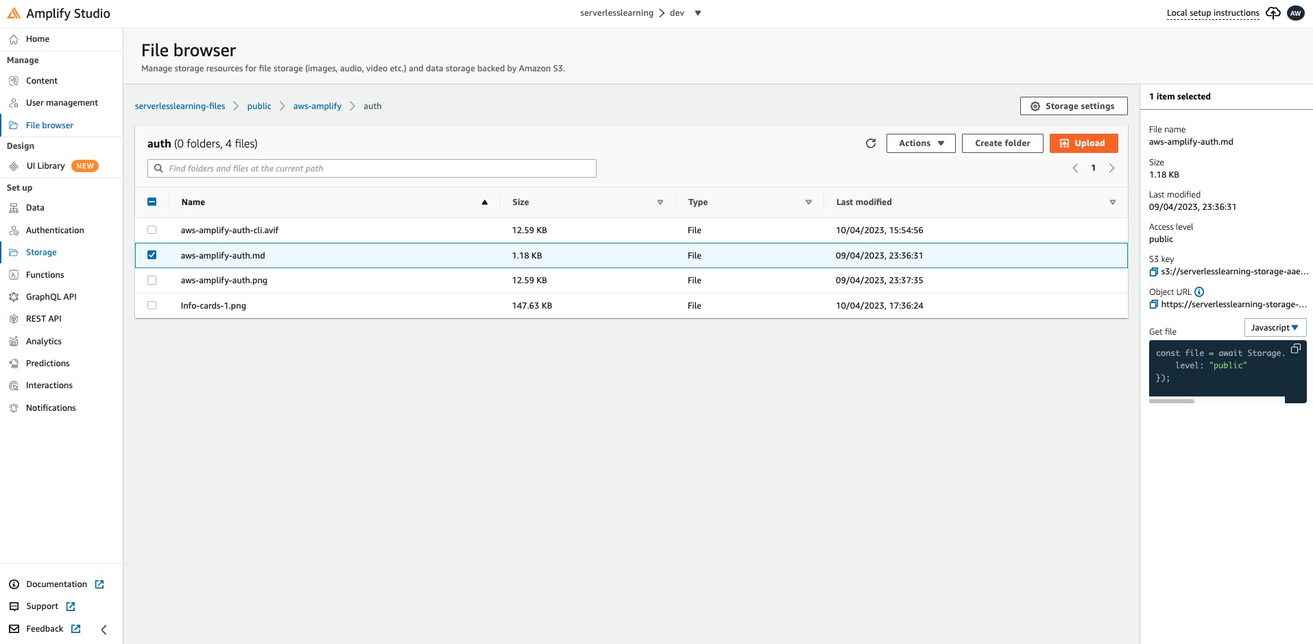
From Amplify Storage, you can navigate across different levels of folders and files and upload the files or create folders. Amplify Studio also provides your with a snippet of code that uses Storage APIs to get the file.
const file = await Storage.get("aws-amplify/auth/aws-amplify-auth.md", {
    level: "public"
});
Figma design to code
Using the getting started Figma design from the community and the components available in this design uses the design guidelines which is a subset of AWS Amplify UI Kit that has a collection of UI components for different UI frameworks both web and mobile.
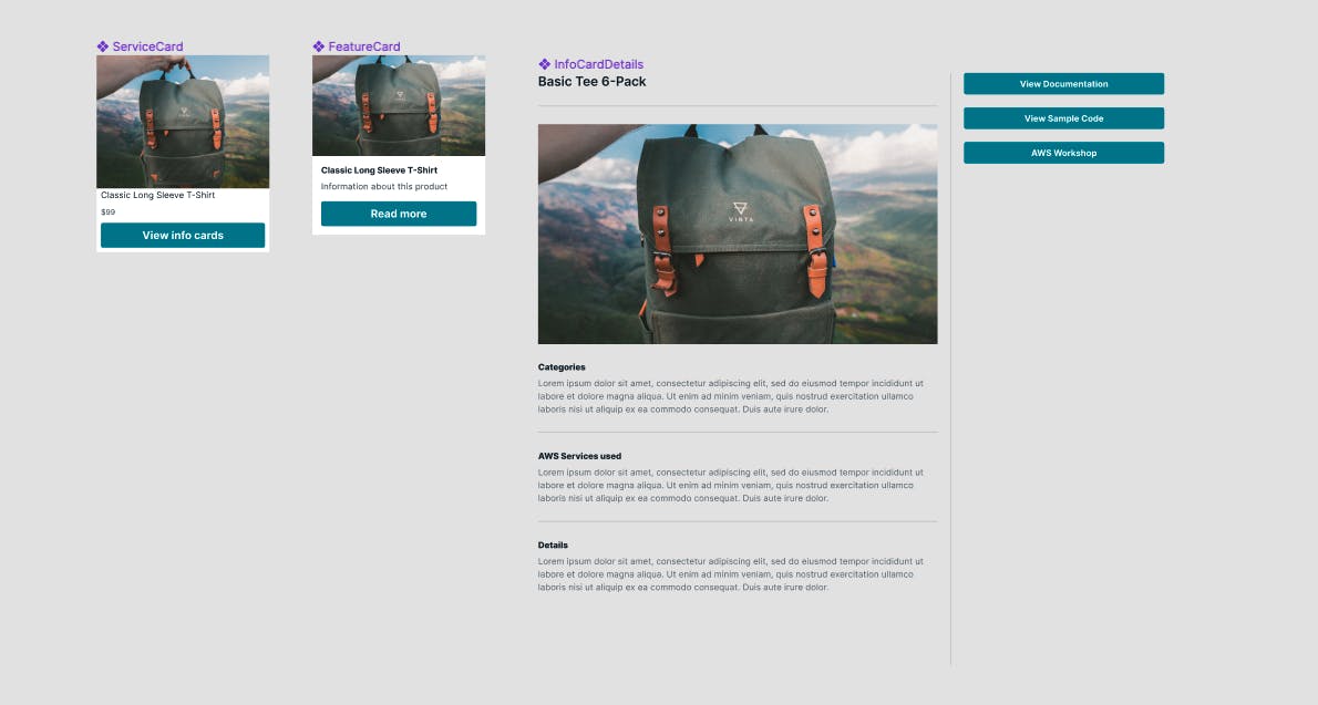
With my limited knowledge of Figma designing and using the pre-defined components and modifying the components as per my requirement, I've successfully created three components - ServiceCard, FeatureCard and InfoCardDetails .
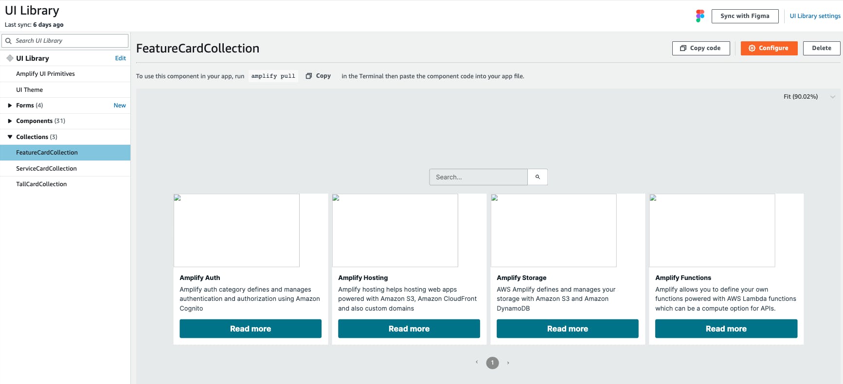
On successfully authorizing AWS Amplify Studio to access Figma designs from my Figma account, the UI Library on Amplify Studio lists all the components ready to be configured and imported into your Amplify project.
Component configuration
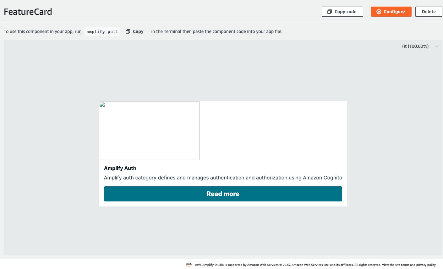
FeatureCard is now ready to be configured with the data that is defined. Amplify Studio provides a tree for all the elements created in this component and configuring different component properties.
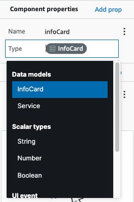
Firstly, map the component to the data model that is used in the component.
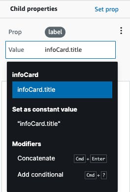
Set each of the child properties with the data from the defined data model. In the above screenshot, you can see the title of the card is set with infoCard.Title to the label property of the child component.
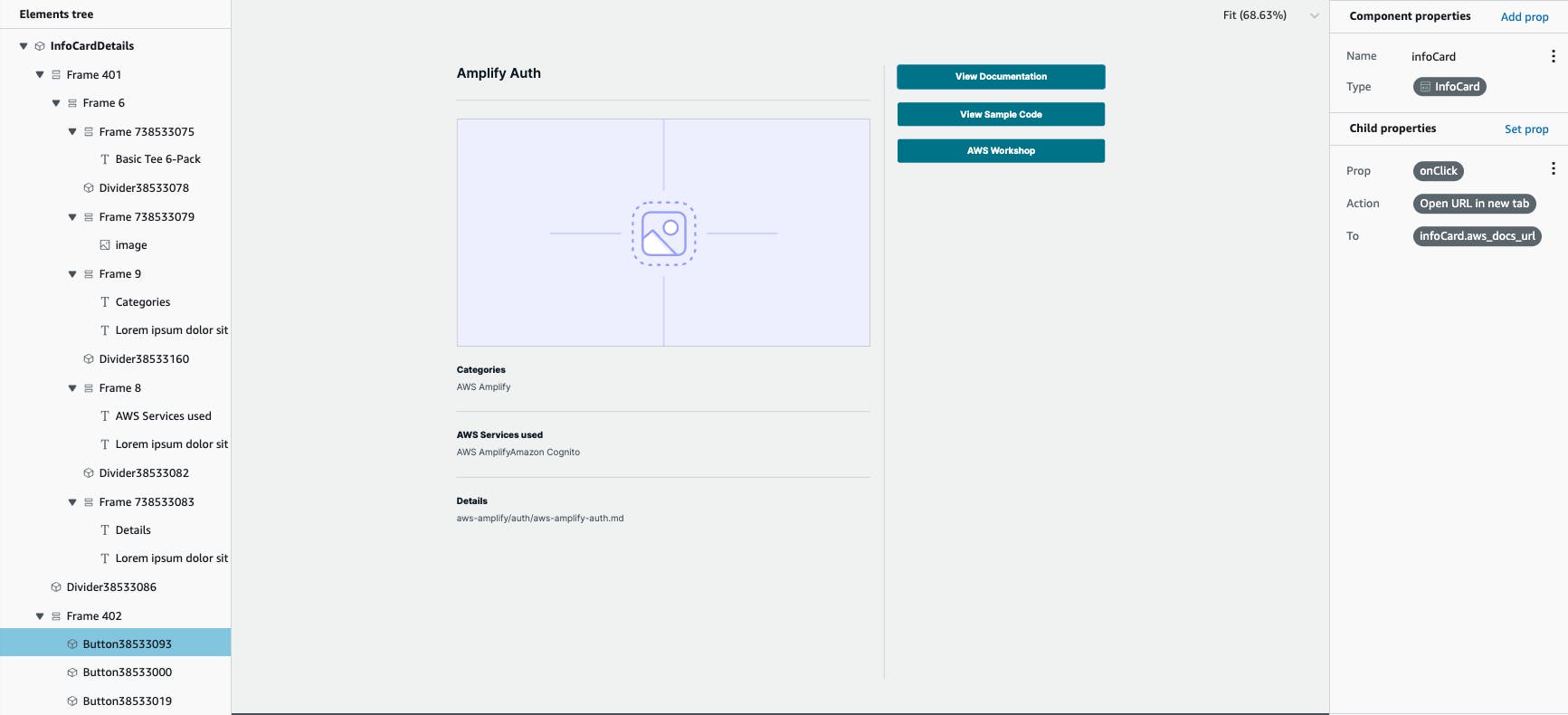
In case of InfoCardDetails component, the data model defines URLs for documentation, samples and workshop. For those to be functional as a button onClick event, Amplify Studio allows those configurations where you can specify the target by selecting Open URL in new tab and also mapping the equivalent data from InfoCard data model.
Collection components
In the component configuration page, click on Create collection button.
The collections can be configured with properties that can make the collections UI really customizable in terms of how they would appear as a - List or Grid, ordering, spacing, alignment, enabling search functionality in the collection and also pagination with the page size.
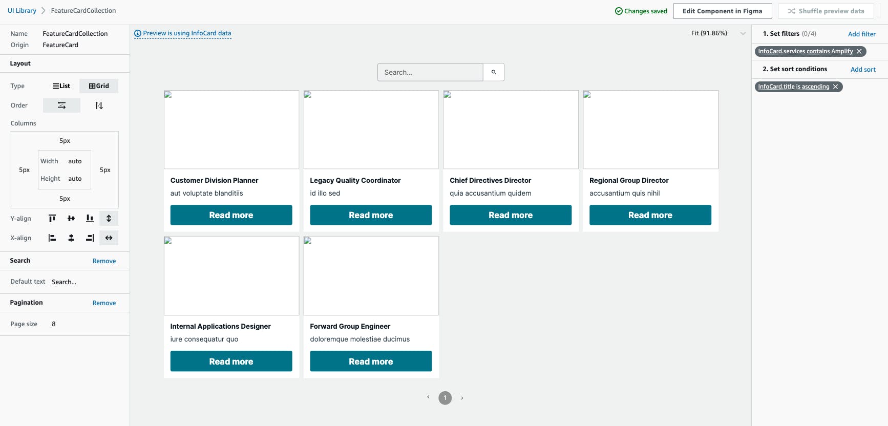
The collections could also be configured with filters which are applied to the collections and also define the sort conditions.
Sync Amplify Studio with local IDE
With the data and UI configurations done on Amplify Studio, these changes can be synced to your local IDE with Amplify CLI.
amplify pull --appId your-amplify-project-id --envName your-env
This will create all the amplify related files in your local project folder with amplify backed and resources configurations under /amplify folder. In your src folder, the UI components and data model related files are generated in /ui-components folder and /models folder respectively.
Importing and using components
Installing the needed npm dependencies.
npm install -g @aws-amplify/cli
npm install aws-amplify @aws-amplify/ui-react
In index.js file, configure Amplify.
import { ThemeProvider } from "@aws-amplify/ui-react";
import { Amplify } from 'aws-amplify';

import awsconfig from './aws-exports';

import "@aws-amplify/ui-react/styles.css";
import { studioTheme } from "./ui-components";

Amplify.configure(awsconfig);
Using a theme from Amplify with ThemeProvider.
<ThemeProvider theme={studioTheme}>
  <App />
</ThemeProvider>
Import the UI component created and configured from Amplify Studio.
import {
 FeatureCardCollection
} from './ui-components';
Modifying the components locally
From the above screenshots, you may have noticed the images being broken while previewing on Amplify Studio. Let's modify the InfoCardDetails component to retrieve data from Amplify Storage.
import React, { useEffect, useState } from "react";
import {
  getOverrideProps,
  useNavigateAction,
} from "@aws-amplify/ui-react/internal";
import { Button, Divider, Flex, Image, Text } from "@aws-amplify/ui-react";
import { Storage } from "aws-amplify"
import { useHistory } from "react-router-dom";

export default function InfoCardDetails(props) {
  const { infoCard, overrides, ...rest } = props;
//Set the states
  const [imageThumbnail, setImageThumbnail] = useState('')
  const [mdDoc, setMDDoc] = useState('')
  useEffect(() => {
    fetchImage()
    fetchMD()
  }, [])

//Using Amplify Storage to download images
  async function fetchImage() {
    try {
      const image = await Storage.get(infoCard.s3_thumbnail, {
        level: "public"
      })
      setImageThumbnail(image)
    } catch (err) { console.log('error fetching images') }
  }
....
//Setting image to Image component
            <Image
              width="unset"
              height="408px"
              display="block"
              gap="unset"
              alignItems="unset"
              justifyContent="unset"
              shrink="0"
              alignSelf="stretch"
              position="relative"
              padding="0px 0px 0px 0px"
              objectFit="cover"
              src={imageThumbnail}
              {...getOverrideProps(overrides, "image")}
            ></Image>
....
}
After modifying the same in FeatureCard and ServiceCard, locally run the app with npm start.
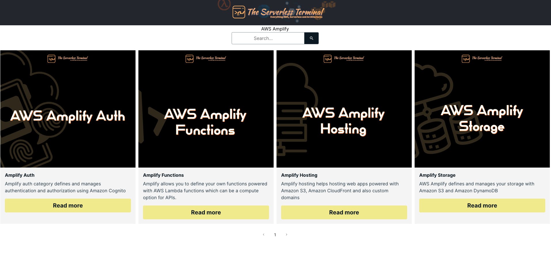
The app renders all the images after they are downloaded from Amplify Storage.
Wrap-up
Building applications with Amplify Studio has certainly amplified developer experience with defining, provisioning, and also managing different AWS services.
Having to do it manually for a full-stack developer during development would mean that they would need in-depth knowledge of all those underlying AWS services.